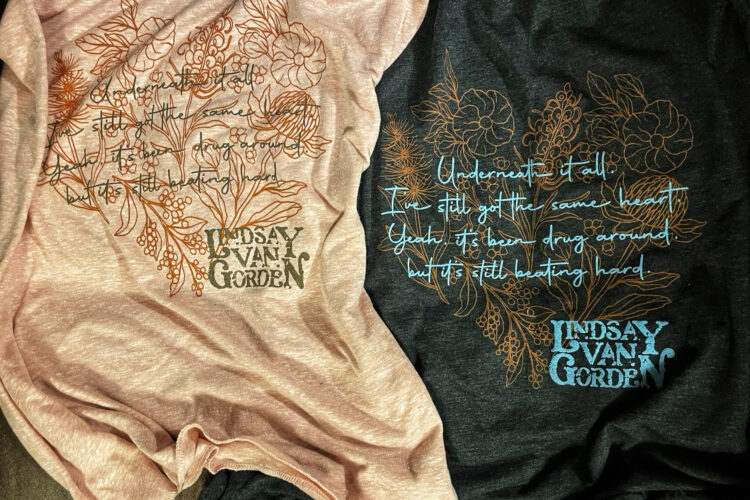
Local country music artist Lindsay Van Gordon reached out to me with a need for some t-shirts to sell at upcoming summer festivals. We settled on two designs: one gender-neutral, the other more feminine.
I started with her name. I researched a few fonts and chose one that closely resembled the look I was going for. I then altered the letters and kerning to get just the right appearance. It wasn’t the original idea Lindsay had for her brand, but she trusted the process and ended up loving the end result.
The gender-neutral shirt design was inspired by a crack in Lindsay’s guitar – suffered by an unfortunate incident where a tent pole blew into the body. She decided to own the imperfection and wanted to include it. This “scar” look also reflects a lot of the music she writes and performs:
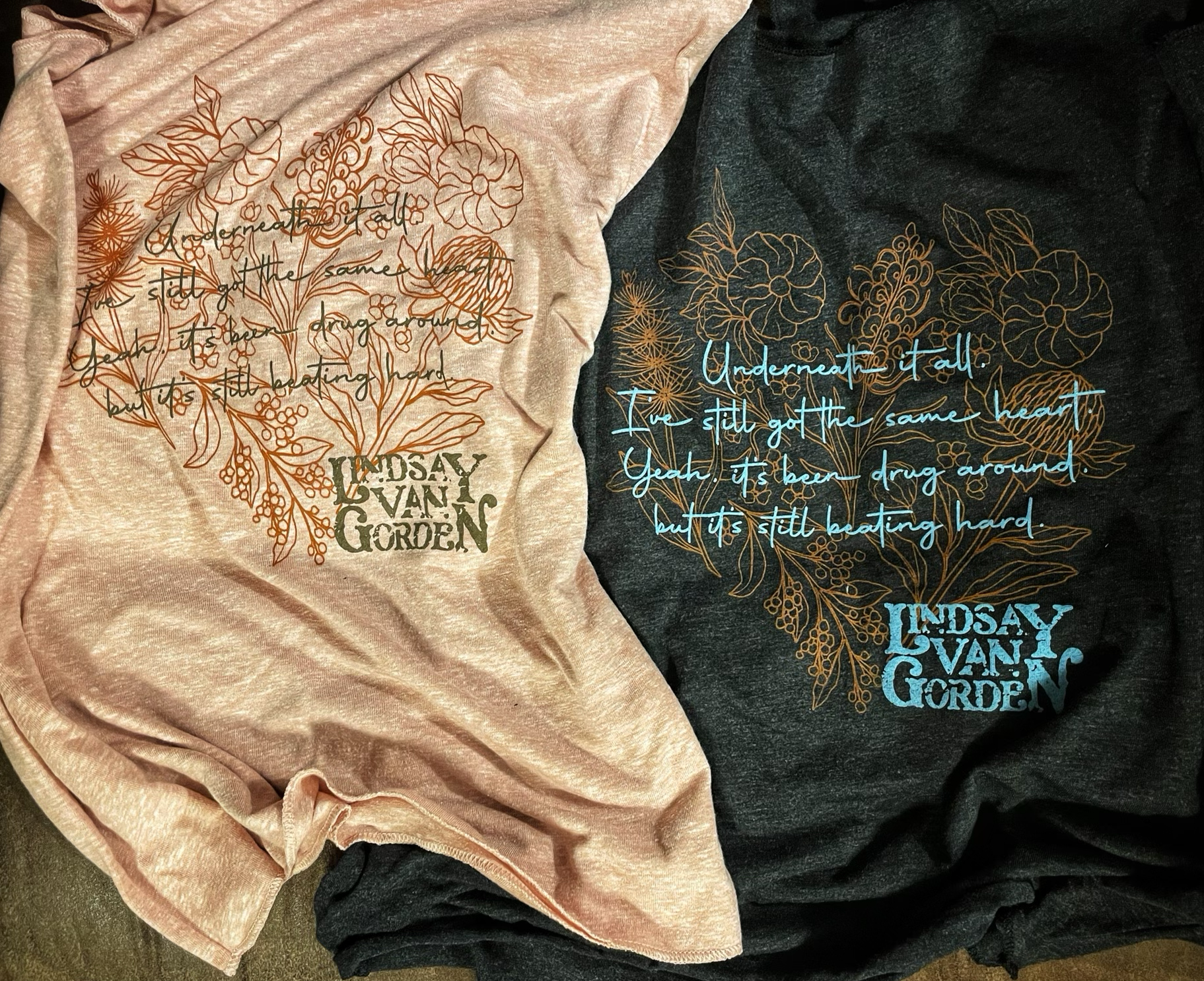
The feminine design came from lyrics from one of Lindsay’s original songs. My challenge here was to include the text in its entirety without appearing too busy or becoming hard to read, yet making Lindsay’s name still identifiable as it all had to relate back to her:
This was an amazingly fun project to work on and offered challenges in typography and iconic branding. All the luck to Lindsay in her musical career!


